How to use the NHS login button
This page explains how to use the NHS login button on your website or app.
There are 3 versions of the NHS login button. You must use the right version for your product and follow the design requirements below.
Before you add the button
NHS login button with the NHS logo
Use this version if no NHS logo is visible on the same screen. This is the version most partner apps and websites use.
View the HTML and CSS for this button
HTML
<button class="nhslogin-button nhslogin-button-logo" type="submit">
  <div class="button-logo">
    <svg class="nhsuk-logo" xmlns="http://www.w3.org/2000/svg" viewBox="0 0 40 16" height="27" width="67">
      <path fill="#fff" d="M0 0h40v16H0z"></path>
      <path fill="#005eb8" d="M3.9 1.5h4.4l2.6 9h.1l1.8-9h3.3l-2.8 13H9l-2.7-9h-.1l-1.8 9H1.1M17.3 1.5h3.6l-1 4.9h4L25 1.5h3.5l-2.7 13h-3.5l1.1-5.6h-4.1l-1.2 5.6h-3.4M37.7 4.4c-.7-.3-1.6-.6-2.9-.6-1.4 0-2.5.2-2.5 1.3 0 1.8 5.1 1.2 5.1 5.1 0 3.6-3.3 4.5-6.4 4.5-1.3 0-2.9-.3-4-.7l.8-2.7c.7.4 2.1.7 3.2.7s2.8-.2 2.8-1.5c0-2.1-5.1-1.3-5.1-5 0-3.4 2.9-4.4 5.8-4.4 1.6 0 3.1.2 4 .6"></path>
    </svg>
  </div>
  Continue to NHS login
</button>
CSS
.nhslogin-button {
  font-weight: 400;
  font-size: 16px;
  font-size: 1rem;
  line-height: 1.5;
  margin-bottom: 28px;
  -webkit-appearance: none;
  appearance: none;
  background-color: #005eb8;
  border: 2px solid transparent;
  border-radius: 4px;
  box-shadow: 0 4px 0 #003087;
  box-sizing: border-box;
  color: #fff;
  cursor: pointer;
  display: inline-block;
  font-weight: 600;
  margin-top: 0;
  padding: 12px 16px;
  position: relative;
  text-align: center;
  vertical-align: top;
  width: auto;
}
@media (min-width: 40.0625em) {
  .nhslogin-button {
    font-size: 19px;
    font-size: 1.1875rem;
    line-height: 1.47368;
  }
}
@media print {
  .nhslogin-button {
    font-size: 14pt;
    line-height: 1.15;
  }
}
@media (min-width: 40.0625em) {
  .nhslogin-button {
    margin-bottom: 36px;
  }
}
@media (max-width: 40.0525em) {
  .nhslogin-button {
    padding: 8px 16px;
  }
}
.nhslogin-button:link,
.nhslogin-button:visited,
.nhslogin-button:active,
.nhslogin-button:hover {
  color: #fff;
  text-decoration: none;
}
.nhslogin-button::-moz-focus-inner {
  border: 0;
  padding: 0;
}
.nhslogin-button:hover {
  background-color: #1e569b;
}
.nhslogin-button:focus {
  background: #ffeb3b;
  box-shadow: 0 4px 0 #003087;
  color: #003087;
  outline: none;
}
.nhslogin-button:active {
  background: #1e569b;
  box-shadow: none;
  color: #fff;
  top: 4px;
}
.nhslogin-button::before {
  background: transparent;
  bottom: -6px;
  content: "";
  display: block;
  left: -2px;
  position: absolute;
  right: -2px;
  top: -2px;
}
.nhslogin-button:active::before {
  top: -6px;
}
.nhslogin-button--reverse {
  background-color: #fff;
  box-shadow: 0 4px 0 #003087;
  color: #005eb8;
}
.nhslogin-button--reverse:hover {
  background-color: #f2f2f2;
  color: #005eb8;
}
.nhslogin-button--reverse:focus {
  background: #ffeb3b;
  box-shadow: 0 4px 0 #003087;
  color: #003087;
  outline: 4px solid transparent;
}
.nhslogin-button--reverse:active {
  background: #f2f2f2;
  box-shadow: none;
  color: #005eb8;
  top: 4px;
}
.nhslogin-button--reverse:link {
  color: #005eb8;
}
.nhslogin-button--reverse.nhsuk-button--disabled {
  background-color: #fff;
}
.nhslogin-button--reverse.nhsuk-button--disabled:focus {
  background-color: #fff;
}
.nhslogin-button--disabled,
.nhslogin-button[disabled="disabled"],
.nhslogin-button[disabled] {
  background-color: #005eb8;
  opacity: 0.5;
  pointer-events: none;
}
.nhslogin-button--disabled:hover,
.nhslogin-button[disabled="disabled"]:hover,
.nhslogin-button[disabled]:hover {
  background-color: #005eb8;
  cursor: default;
}
.nhslogin-button--disabled:focus,
.nhslogin-button[disabled="disabled"]:focus,
.nhslogin-button[disabled]:focus {
  background-color: #005eb8;
  outline: none;
}
.nhslogin-button--disabled:active,
.nhslogin-button[disabled="disabled"]:active,
.nhslogin-button[disabled]:active {
  box-shadow: 0 4px 0 #003087;
  top: 0;
}
.nhslogin-button--reverse[disabled="disabled"],
.nhslogin-button--reverse[disabled] {
  background-color: #fff;
  opacity: 0.5;
}
.nhslogin-button--reverse[disabled="disabled"]:hover,
.nhslogin-button--reverse[disabled]:hover {
  background-color: #fff;
  cursor: default;
}
.nhslogin-button--reverse[disabled="disabled"]:focus,
.nhslogin-button--reverse[disabled]:focus {
  outline: none;
}
.nhslogin-button--reverse[disabled="disabled"]:active,
.nhslogin-button--reverse[disabled]:active {
  box-shadow: 0 4px 0 #003087;
  top: 0;
}
.ie8 .nhslogin-button:focus {
  outline: 1px dotted #003087;
}

.nhslogin-button-logo {
    display: flex;
    align-items: center;
    justify-content: center;
}

.button-logo {
    padding-right: 16px;
    display: flex;
    align-items: center;
    justify-content: center;
}
Download the button package with the NHS logo.
Place this button on your sign-in or registration screen
If you offer other native or third-party sign-in or registration options, show NHS login first and make it as clear and visible as the other options. If you have a clear user need not to do this, contact NHS login with evidence before making the change.
Keep it separate from other forms
Do not show the button beside other entry fields. If there is a clear user need to show another form on the same screen, put NHS login first and make a clear distinction between the button and the form, as shown in the example.
Size and space the button correctly
You can resize the button for different screen sizes, but do not stretch it. Keep the supplied proportions, spacing and shadow measurements. The button files include the approved hover, focus and pressed states.
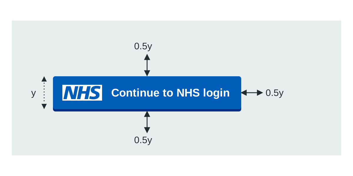
Leave clear space equal to at least half the height of the button on every side.
NHS login button without the NHS logo
Use this version only when the NHS logo is already visible on the screen where people select NHS login. It does not repeat the NHS logo.
Follow the placement, form-separation and sizing guidance above for this button version.
View the HTML and CSS for this button
HTML
<button class="nhslogin-button" type="submit">Continue to NHS login</button>CSS
.nhslogin-button {
  font-weight: 400;
  font-size: 16px;
  font-size: 1rem;
  line-height: 1.5;
  margin-bottom: 28px;
  -webkit-appearance: none;
  appearance: none;
  background-color: #005eb8;
  border: 2px solid transparent;
  border-radius: 4px;
  box-shadow: 0 4px 0 #003087;
  box-sizing: border-box;
  color: #fff;
  cursor: pointer;
  display: inline-block;
  font-weight: 600;
  margin-top: 0;
  padding: 12px 16px;
  position: relative;
  text-align: center;
  vertical-align: top;
  width: auto;
}
@media (min-width: 40.0625em) {
  .nhslogin-button {
    font-size: 19px;
    font-size: 1.1875rem;
    line-height: 1.47368;
  }
}
@media print {
  .nhslogin-button {
    font-size: 14pt;
    line-height: 1.15;
  }
}
@media (min-width: 40.0625em) {
  .nhslogin-button {
    margin-bottom: 36px;
  }
}
@media (max-width: 40.0525em) {
  .nhslogin-button {
    padding: 8px 16px;
  }
}
.nhslogin-button:link,
.nhslogin-button:visited,
.nhslogin-button:active,
.nhslogin-button:hover {
  color: #fff;
  text-decoration: none;
}
.nhslogin-button::-moz-focus-inner {
  border: 0;
  padding: 0;
}
.nhslogin-button:hover {
  background-color: #1e569b;
}
.nhslogin-button:focus {
  background: #ffeb3b;
  box-shadow: 0 4px 0 #003087;
  color: #003087;
  outline: none;
}
.nhslogin-button:active {
  background: #1e569b;
  box-shadow: none;
  color: #fff;
  top: 4px;
}
.nhslogin-button::before {
  background: transparent;
  bottom: -6px;
  content: "";
  display: block;
  left: -2px;
  position: absolute;
  right: -2px;
  top: -2px;
}
.nhslogin-button:active::before {
  top: -6px;
}
.nhslogin-button--reverse {
  background-color: #fff;
  box-shadow: 0 4px 0 #003087;
  color: #005eb8;
}
.nhslogin-button--reverse:hover {
  background-color: #f2f2f2;
  color: #005eb8;
}
.nhslogin-button--reverse:focus {
  background: #ffeb3b;
  box-shadow: 0 4px 0 #003087;
  color: #003087;
  outline: 4px solid transparent;
}
.nhslogin-button--reverse:active {
  background: #f2f2f2;
  box-shadow: none;
  color: #005eb8;
  top: 4px;
}
.nhslogin-button--reverse:link {
  color: #005eb8;
}
.nhslogin-button--reverse.nhsuk-button--disabled {
  background-color: #fff;
}
.nhslogin-button--reverse.nhsuk-button--disabled:focus {
  background-color: #fff;
}
.nhslogin-button--disabled,
.nhslogin-button[disabled="disabled"],
.nhslogin-button[disabled] {
  background-color: #005eb8;
  opacity: 0.5;
  pointer-events: none;
}
.nhslogin-button--disabled:hover,
.nhslogin-button[disabled="disabled"]:hover,
.nhslogin-button[disabled]:hover {
  background-color: #005eb8;
  cursor: default;
}
.nhslogin-button--disabled:focus,
.nhslogin-button[disabled="disabled"]:focus,
.nhslogin-button[disabled]:focus {
  background-color: #005eb8;
  outline: none;
}
.nhslogin-button--disabled:active,
.nhslogin-button[disabled="disabled"]:active,
.nhslogin-button[disabled]:active {
  box-shadow: 0 4px 0 #003087;
  top: 0;
}
.nhslogin-button--reverse[disabled="disabled"],
.nhslogin-button--reverse[disabled] {
  background-color: #fff;
  opacity: 0.5;
}
.nhslogin-button--reverse[disabled="disabled"]:hover,
.nhslogin-button--reverse[disabled]:hover {
  background-color: #fff;
  cursor: default;
}
.nhslogin-button--reverse[disabled="disabled"]:focus,
.nhslogin-button--reverse[disabled]:focus {
  outline: none;
}
.nhslogin-button--reverse[disabled="disabled"]:active,
.nhslogin-button--reverse[disabled]:active {
  box-shadow: 0 4px 0 #003087;
  top: 0;
}
.ie8 .nhslogin-button:focus {
  outline: 1px dotted #003087;
}

.nhslogin-button-logo {
    display: flex;
    align-items: center;
    justify-content: center;
}

.button-logo {
    padding-right: 16px;
    display: flex;
    align-items: center;
    justify-content: center;
}
Download the button package without the NHS logo.
NHS Design System button
Only NHS services that use the NHS Design System can use this version, for example the NHS App. The button uses the label Continue.
Follow the placement, form-separation and sizing guidance above for this button version.
View the HTML and CSS for this button
HTML
<button class="nhslogin-button" type="submit">Continue</button>CSS
.nhslogin-button {
  font-weight: 400;
  font-size: 16px;
  font-size: 1rem;
  line-height: 1.5;
  margin-bottom: 28px;
  -webkit-appearance: none;
  appearance: none;
  background-color: #005eb8;
  border: 2px solid transparent;
  border-radius: 4px;
  box-shadow: 0 4px 0 #003087;
  box-sizing: border-box;
  color: #fff;
  cursor: pointer;
  display: inline-block;
  font-weight: 600;
  margin-top: 0;
  padding: 12px 16px;
  position: relative;
  text-align: center;
  vertical-align: top;
  width: auto;
}
@media (min-width: 40.0625em) {
  .nhslogin-button {
    font-size: 19px;
    font-size: 1.1875rem;
    line-height: 1.47368;
  }
}
@media print {
  .nhslogin-button {
    font-size: 14pt;
    line-height: 1.15;
  }
}
@media (min-width: 40.0625em) {
  .nhslogin-button {
    margin-bottom: 36px;
  }
}
@media (max-width: 40.0525em) {
  .nhslogin-button {
    padding: 8px 16px;
  }
}
.nhslogin-button:link,
.nhslogin-button:visited,
.nhslogin-button:active,
.nhslogin-button:hover {
  color: #fff;
  text-decoration: none;
}
.nhslogin-button::-moz-focus-inner {
  border: 0;
  padding: 0;
}
.nhslogin-button:hover {
  background-color: #1e569b;
}
.nhslogin-button:focus {
  background: #ffeb3b;
  box-shadow: 0 4px 0 #003087;
  color: #003087;
  outline: none;
}
.nhslogin-button:active {
  background: #1e569b;
  box-shadow: none;
  color: #fff;
  top: 4px;
}
.nhslogin-button::before {
  background: transparent;
  bottom: -6px;
  content: "";
  display: block;
  left: -2px;
  position: absolute;
  right: -2px;
  top: -2px;
}
.nhslogin-button:active::before {
  top: -6px;
}
.nhslogin-button--reverse {
  background-color: #fff;
  box-shadow: 0 4px 0 #003087;
  color: #005eb8;
}
.nhslogin-button--reverse:hover {
  background-color: #f2f2f2;
  color: #005eb8;
}
.nhslogin-button--reverse:focus {
  background: #ffeb3b;
  box-shadow: 0 4px 0 #003087;
  color: #003087;
  outline: 4px solid transparent;
}
.nhslogin-button--reverse:active {
  background: #f2f2f2;
  box-shadow: none;
  color: #005eb8;
  top: 4px;
}
.nhslogin-button--reverse:link {
  color: #005eb8;
}
.nhslogin-button--reverse.nhsuk-button--disabled {
  background-color: #fff;
}
.nhslogin-button--reverse.nhsuk-button--disabled:focus {
  background-color: #fff;
}
.nhslogin-button--disabled,
.nhslogin-button[disabled="disabled"],
.nhslogin-button[disabled] {
  background-color: #005eb8;
  opacity: 0.5;
  pointer-events: none;
}
.nhslogin-button--disabled:hover,
.nhslogin-button[disabled="disabled"]:hover,
.nhslogin-button[disabled]:hover {
  background-color: #005eb8;
  cursor: default;
}
.nhslogin-button--disabled:focus,
.nhslogin-button[disabled="disabled"]:focus,
.nhslogin-button[disabled]:focus {
  background-color: #005eb8;
  outline: none;
}
.nhslogin-button--disabled:active,
.nhslogin-button[disabled="disabled"]:active,
.nhslogin-button[disabled]:active {
  box-shadow: 0 4px 0 #003087;
  top: 0;
}
.nhslogin-button--reverse[disabled="disabled"],
.nhslogin-button--reverse[disabled] {
  background-color: #fff;
  opacity: 0.5;
}
.nhslogin-button--reverse[disabled="disabled"]:hover,
.nhslogin-button--reverse[disabled]:hover {
  background-color: #fff;
  cursor: default;
}
.nhslogin-button--reverse[disabled="disabled"]:focus,
.nhslogin-button--reverse[disabled]:focus {
  outline: none;
}
.nhslogin-button--reverse[disabled="disabled"]:active,
.nhslogin-button--reverse[disabled]:active {
  box-shadow: 0 4px 0 #003087;
  top: 0;
}
.ie8 .nhslogin-button:focus {
  outline: 1px dotted #003087;
}

.nhslogin-button-logo {
    display: flex;
    align-items: center;
    justify-content: center;
}

.button-logo {
    padding-right: 16px;
    display: flex;
    align-items: center;
    justify-content: center;
}
Download the NHS Design System button package.
What happens after someone selects an NHS login button
This applies to all 3 button versions. NHS login manages the sign-in and verification journey after someone selects the button, then returns them to your service.
Ask for help or request a change
Contact NHS login developer support if you need help applying this guidance or want to request a change to the NHS login button.
Edit this page on GitHub